Data vis + Chart Design System
Company: Enigma Role: Lead Product Designer
Design Timeline: June 2018 - Aug 2018 | Category: Design System, Data Visualization
Tools: Sketch, Figma, D3.js | Collaborators: Isa Gouverneur (Design Director), Whitman Schorn (Software Engineer), Liam Cain (Software Engineer)
Data Visualization & Charts in Design System
As a product design team at Enigma, we design user experiences for data applications and Proof of Concepts (PoCs) for our clients' specific business use cases. To accomplish this, we work closely with data scientists and engineers.
During our design process, we identified the need for a reusable chart library that could help us make more informed decisions about which chart types to use for specific data and improve the efficiency and consistency of designing chart visuals for UI mockups. To address this need, I took the lead in designing chart frameworks and UI guidelines that followed data visualization rules and best practices.
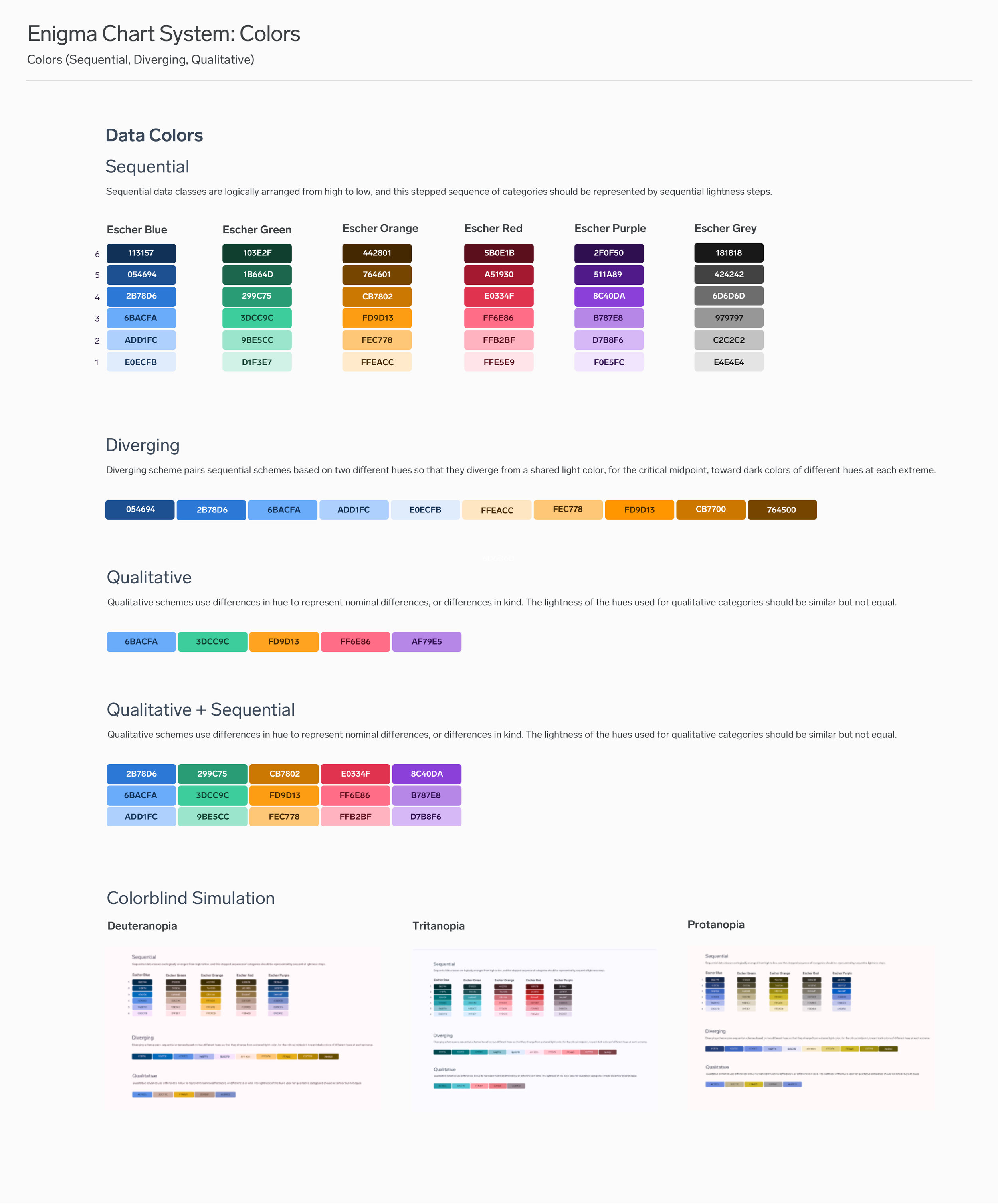
We integrated the initial data visualization library into Enigma's Escher design system, providing designers with a comprehensive set of reusable chart UI components for data-heavy user interfaces. The library also included detailed guidelines for when to use specific chart types for different data types. Together with our front-end engineers, we built most of the chart samples using D3.js in our design system's Storybook and Contentful CMS. This allowed us to easily reuse the chart components by simply inputting JSON data into the CMS.
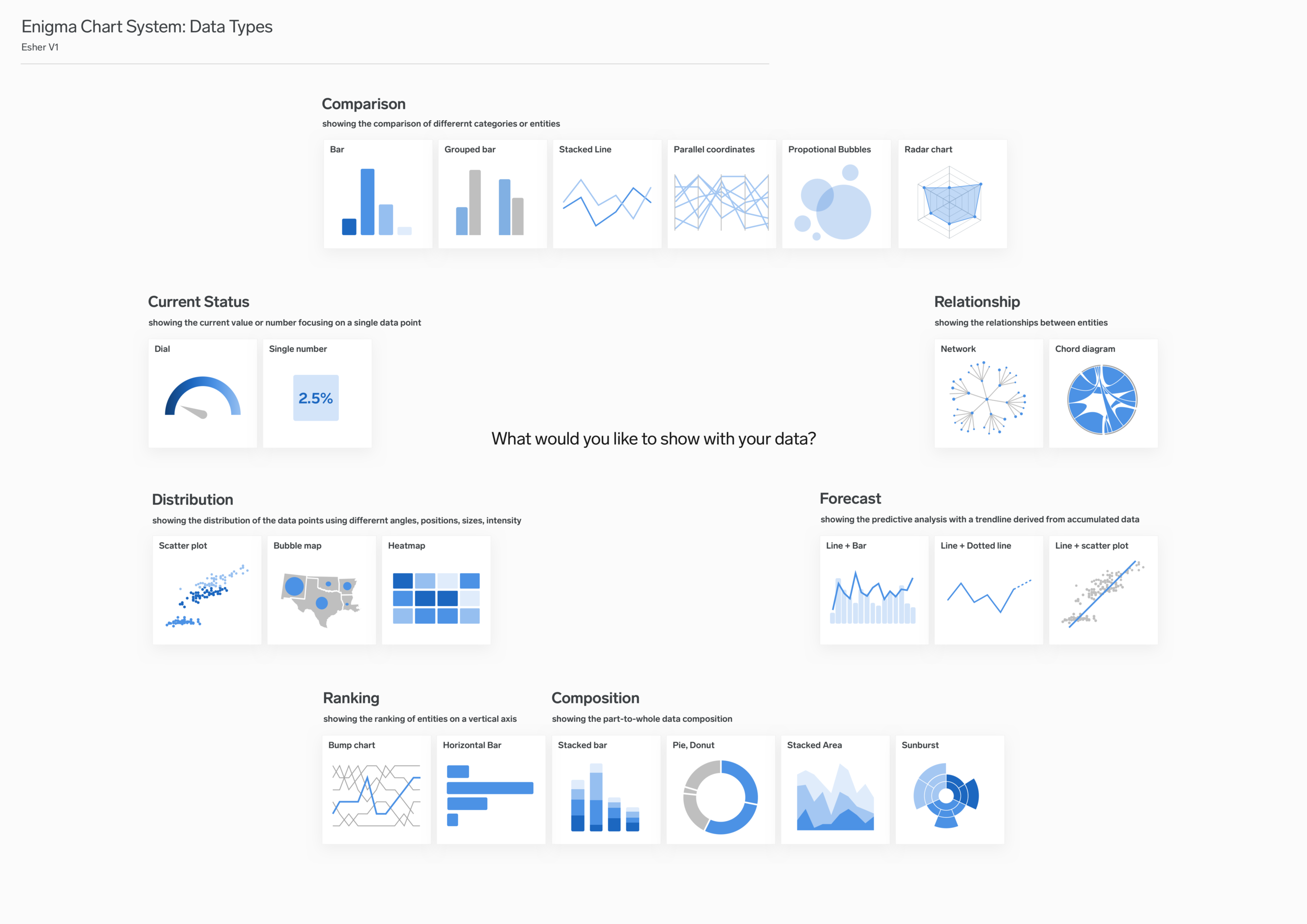
Defining chart types for each data use case
Defining chart types for each data use case involves determining the most appropriate chart type to use for a given set of data, based on its unique characteristics and the insights that you are trying to convey. This can be a complex task that requires careful analysis of the data, an understanding of the underlying business goals, and a knowledge of data visualization best practices.

Building reusable data visualization React Components

Together with front-end engineers, we worked on building reusable chart components using React, which we then documented in Storybook. This approach allowed us to create a comprehensive library of chart components that can be easily reused in different contexts, providing a consistent and efficient solution for data visualization.
To further enhance the usability of our chart library, we also added the components as custom elements to Enigma's website CMS. This allowed us to seamlessly integrate charts into various content types, such as blog posts and dashboard pages, providing a more engaging and dynamic way to visualize data.
By making the chart components available through the CMS, we were able to significantly streamline the process of creating and publishing data visualizations, which in turn allowed us to create more dynamic and engaging content for our users. Additionally, this approach provided a more consistent and efficient way to build and deploy data visualizations across different contexts and use cases, ultimately contributing to a more effective and impactful data visualization strategy for Enigma.
Chart Guidelines


Chart Components


Interaction Design and Use Cases
References:
Wall Street Journal Guide to Information Graphics by Dona M. Wong
Visual Complexity: Mapping Patterns of Information by Manuel Lima
The Visual Display of Quantitative Information by Edward Tufte
Envisioning Information by Edward Tufte
Square, Circle, Triangle by Bruno Munari
Data Points by Nathan Yau
