The Diversity and Inclusion Guild is a new group at Enigma focusing on ensuring the cultivation of both a diverse and inclusive culture. Related Article
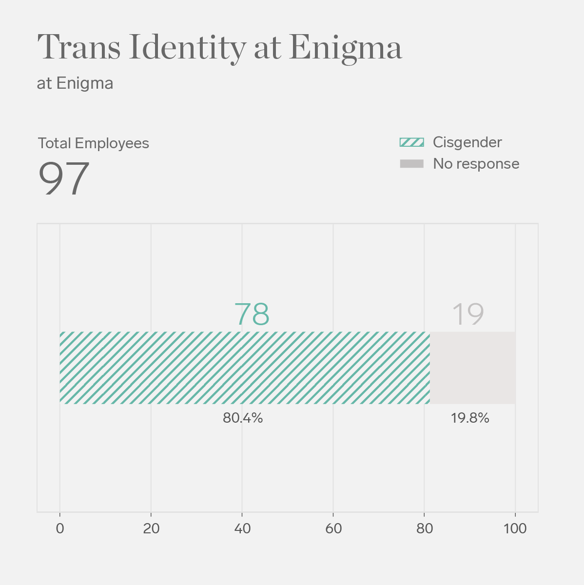
These data charts are the results of an internal D&I survey and publishing a public report on our diversity data.
Our June 2018 Diversity & Inclusion survey was sent to 97 full-time employees, of which 78.4% responded.
Designer: Jiyeon (Jenny) Kang
Project team: Anh-Thu Huynh (Diversity and Inclusion Guild), Vivien Ngo (Data Journalism Fellow), Kat Tuttle (People Team)
While women actually make up a lower percentage of CS grads in recent years than seen in 1991/1992, the sheer volume of women has increased significantly.


